NEW! Video Cost Calculator. Get an estimate for your project in less than a minute.
| Quick answer: The best explainer video examples should run 60 to 90 seconds long. Across the 53 we produced for real clients below, the median is 1:15 and 82% come in under two minutes. It could be a 30-second product teaser or a 3:20 enterprise walkthrough. Length follows placement: a landing-page hero earns about 60 seconds, a mid-sales-cycle deep dive earns three. |
An explainer video is an animated or live action video that clearly explains a product, service, or idea in a way that inspires action. That action varies from buying a product, signing up for a service, supporting, and the list is endless.Â
In this article, you will find 38 videos that cover these areas: product and platform, fintech and financial services, enterprise and industrial, nonprofit and public sector, and education and training.
The length of the video is worth paying attention to. In our 2026 video marketing statistics roundup, 90% or more of internet users watch online video every week, and 65% of viewers finish a video that is under a minute against about 20% for anything over twenty minutes. Across these 38 the median runtime is 1:15, and 82% run under two minutes.
| Runtime band | Videos | Share | Typical use |
|---|---|---|---|
| Under 1:00 | 4 | 12% | Ads, teasers, single-promise products |
| 1:01 to 1:30 | 13 | 41% | The default explainer |
| 1:31 to 2:00 | 10 | 31% | Multi-step products, regulated categories |
| Over 2:00 | 5 | 16% | Enterprise, training, instructional |
Nearly three-quarters of these videos are between one and two minutes long. That gives you enough time to explain the problem, show how the solution works, and tell the viewer what to do next.
There’s also a reason shorter videos tend to work better. 65% of viewers finish a video under a minute, while only about 20% finish videos longer than 20 minutes. On Instagram, 52% of users engage most with short-form video under 60 seconds. People simply don’t give every video much time, especially when they’re casually browsing.
The five videos on this list that run longer than two minutes are different. In each case, the viewer has a reason to keep watching. They’re researching enterprise IT, going through accessibility training, learning about policy, or reviewing an industrial product. If someone is casually browsing, I’d try to keep the video under two minutes. If they need the information to do their job or make a decision, it can be longer.
Â
If you’re specifically looking for software examples, we also put together 31 SaaS explainer video examples.
Answer a few quick questions and get a price range in less than a minute.
| # | Brand | Sector | Style | Runtime |
|---|---|---|---|---|
| 1 | Canonical | SaaS / software | 2D animation | 1:41 |
| 2 | Augmentt | SaaS / software | Motion graphics | 1:34 |
| 3 | Skyflow | SaaS / software | Motion graphics | 1:02 |
| 4 | Copilot AI | SaaS / software | Motion graphics | 1:06 |
| 5 | AlphaMap | SaaS / software | 2D animation | 1:05 |
| 6 | Abuzz | SaaS / software | Motion graphics | 1:10 |
| 7 | IPGOBox | SaaS / software | 2D animation | 1:00 |
| 8 | Claimwell | SaaS / software | Motion graphics | 1:15 |
| 9 | ChartLamp | SaaS / software | 2D animation | 1:05 |
| 10 | Keebo | SaaS / software | 2D animation | 0:30 |
| 11 | Astronomer | SaaS / software | Motion graphics | 1:00 |
| 12 | Blockdaemon | SaaS / software | Motion graphics | 1:06 |
| 13 | Acrisure | Fintech | 3D | 1:08 |
| 14 | Assurance Wilson | Fintech | 2D animation | 1:14 |
| 15 | CryptoSea | Fintech | Motion graphics | 1:01 |
| 16 | CryptoSea Premium Indicator | Fintech | Motion graphics | 1:00 |
| 17 | Ice Chain | Fintech | Motion graphics | 1:07 |
| 18 | Fujitsu | Enterprise | 2D animation | 3:20 |
| 19 | Contruent | Enterprise | 3D | 1:38 |
| 20 | Warner Brothers | Enterprise | 2D animation | 1:16 |
| 21 | Stealthbox | Enterprise | Motion graphics | 1:10 |
| 22 | IISD (Stop Funding Overfishing) | Nonprofit / public sector | 2D animation | 2:13 |
| 23 | Family Caregiver Alliance | Nonprofit / public sector | 2D animation | 2:27 |
| 24 | YWCA (BlockHate) | Nonprofit / public sector | 2D animation | 1:31 |
| 25 | CLAS BC (Stand Informed) | Nonprofit / public sector | Animation | 1:36 |
| 26 | Disability Rights Oregon | Nonprofit / public sector | 2D animation | 1:04 |
| 27 | Accounting Aid Society | Nonprofit / public sector | 2D animation | 1:32 |
| 28 | Small Business BC | Nonprofit / public sector | Animation | 3:18 |
| 29 | Re-energizing Canada | Nonprofit / public sector | 2D animation | 1:25 |
| 30 | Accelerate | Nonprofit / public sector | Motion graphics | 1:18 |
| 31 | Rancho Water | Nonprofit / public sector | Animation | 6:37 |
| 32 | Silvacom (Woodland Caribou) | Nonprofit / public sector | Animation | 1:11 |
| 33 | VOITs | Nonprofit / public sector | 2D animation | 1:33 |
| 34 | Dairy Farmers of Canada | Nonprofit / public sector | 2D animation | 0:25 |
| 35 | City of Overland Park | Nonprofit / public sector | 2D animation | 2:50 |
| 36 | Stereotypes Training Video | Nonprofit / public sector | Animation | 1:31 |
| 37 | Tourism Burnaby | Nonprofit / public sector | Animation | 2:55 |
| 38 | Dr. Bill | Healthcare | Motion graphics | 1:05 |
We have worked with hundreds of SaaS companies, from seed-stage startups to platforms like Ubuntu-maker Canonical. A SaaS explainer walks a viewer through the problem, the product and the payoff in about a minute — the fastest way to make software you cannot touch feel concrete. For startups, one strong video does the pitch on the homepage, in the deck and in ads, telling the same clear story at every stage of the funnel.

Canonical wanted a tour of everywhere Ubuntu actually runs, so that’s what we made. It moves from developer desks and code editors into server racks, then out to robotics arms, connected devices, cars on the road and enterprise buildings. We answered one question, where does this thing live, with places instead of adjectives. The whole piece is isometric illustration in Canonical’s orange.

LinkedIn prospecting works, but nobody can do it manually at scale. That’s the setup. CoPilot AI is the automation, and the video walks its five steps in order: identify, craft, automate, engage, alert. The one image we kept concrete is starting conversations with hundreds of prospects while you drink your coffee.

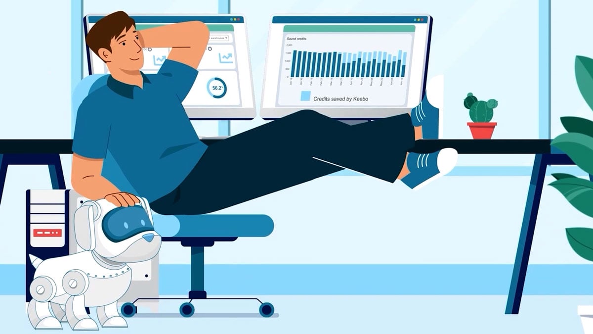
Keebo automates Snowflake optimization. The script gives you the two options you already know, staring at queries or tweaking warehouse parameters by trial and error, then the third one. It’s 30 seconds. There was one promise to make: set up in minutes, saving within days.

This one has no voiceover. It’s a motion graphics piece where the on-screen text and the logos do the talking, with cloud platforms like AWS, Azure and Google Cloud animating around the line “Run on any cloud”. Worth including on the page for exactly that reason: not every explainer needs narration. When the message is a compatibility claim, showing the logos moving together makes the point in less time than a script would.

The most abstract product on this page: AI-driven storytelling that adapts to the viewer. We kept it concrete by naming devices, television, computer, autonomous vehicle, immersive headset, and by using the lean-back versus lean-forward split people already understand. It ends on content that meets you where you are because of who you are.
Security products are hard to show because the threat is invisible and the buyer is skeptical. These cybersecurity explainers name the risk plainly and show how the product closes it, without the doom-heavy clichés of the category. For security startups, that clarity shortens the sales conversation — the video does the technical framing before the demo call.

Augmentt sells SaaS management to IT and security teams. The video’s first job was naming the problem: anyone in a company can sign up for a SaaS tool, nobody checks the cost or the risk, and that’s shadow IT. The platform comes in as three stages, Discover, Optimize, Engage. We ended on what buyers are actually doing today, which is tracking all of this in spreadsheets.

Nearly the whole script is questions. What if you could build fast but not break privacy, what if compliance took a few API calls, how much faster could you ship. Skyflow gets named a third of the way in as a zero trust data privacy vault delivered as an API, and the opening question comes back as the closing line. PCI, CCPA, GDPR and SOC 2 each get one fast mention near the end, where they belong.

The script opens on the cost of the status quo: billions lost to theft, and security guards who run $80,000 to $120,000 a year. ACS’s answer is continuous surveillance monitoring — AI cameras tracking people and vehicles, agents zooming in remotely, law enforcement notified the moment something is off. The video sells the comparison, not the technology: facial recognition, fall alerts and fire detection for a fraction of the cost of boots on the ground.
A second Blockdaemon commission, this one focused on security — motion graphics made for an institutional audience.
Financial products carry jargon, regulation and real stakes. These fintech and financial explainers turn plans, policies and strategies into stories a client can follow without a glossary. Startups and advisors use them to build trust early: a viewer who understands the offer is far more comfortable booking the meeting.

Acrisure helps businesses with fifty or more employees move to self-funded medical plans. Owners and employees want different things from benefits, so the first fifteen seconds name both: owners want retention with low risk and cost, employees want coverage they can afford. Then three offerings in plain terms, actuarial analysis, stop-loss protection, and captives that pool smaller companies to spread risk.

A tax strategy video built around one person. Mike owns a business with over twenty million dollars in his holding company and wants to keep growing it, and the script follows his money through a corporate-owned life insurance structure: a death benefit that moves funds out of the corporation tax-free through the capital dividend account, and a cash component for funding business opportunities. We used Mike because the structure is hard to follow without someone to follow.
A motion graphics explainer for JM Bullion, an online precious-metals retailer — a finance category where clean visuals and concrete claims carry the trust.
We have produced explainers for blockchain infrastructure firms, trading platforms and Web3 startups. A blockchain explainer has one job: make an abstract protocol feel like a product with a clear benefit. For crypto startups, that translation is the difference between a visitor who bounces and one who signs up.

Blockdaemon runs blockchain infrastructure for institutions, and that audience reads detail as credibility. So the detail is in: more than seventy points of presence, cloud and bare metal, 24/7 monitoring, manual failover, insurance against slashing and double signing. The close names who’s already built on it, exchanges, custodians and large financial institutions.

This one opens with a number: 97% of traders lose money. CryptoSea’s bot does the trading for you, so the script stays on what you don’t have to do. No charts to decode, no split-second decisions. The close answers the sceptic directly, anyone can make money in a bull market, this is built for any conditions.

The companion video for CryptoSea’s TradingView indicator. Where the first video is about handing trading off, this one is about decision quality: signals confirmed with external indicators, strategies matched to each asset and timeframe, timing on entries and exits. The last line names what buyers compare on, simplicity, accuracy, profitability.

Ice Chain is a blockchain ecosystem built around data ownership. The setup runs through faster internet, bigger storage and AI predicting behaviour, then asks what your digital identity is worth and who has it right now. For crypto, the walkthrough stays unusually concrete: a decentralised wallet, your private key, staking pools, an NFT marketplace. Last line of the script: from now on, your data is yours.
Our healthcare explainer work spans hospital software, medical billing and health tech platforms. These videos explain clinical and administrative products in plain language, for audiences from physicians to patients. Health tech startups use them to make complex, regulated products understandable in the first minute of a conversation.

Medical providers wait months to get paid by insurers, and the script starts there: negotiations, collection agencies, legal costs. ClaimWell moves billing documents and records to payers over a HIPAA compliant platform with automated follow-up and digital payment reminders. Both sides get a line at the end. Insurers keep good payment rates, providers get paid on time.

Reviewing medical records feels like being in a dark room, knocking things over to find the one thing you need. That’s the first line of the script. ChartLamp converts text records into visual anatomy maps, so everything after that is before and after. One cost claim carries the close: up to ninety percent less than text-based summaries.

Fujitsu built a surgical scheduling tool with Baptist Health South Florida, and hospital trials measured a 37% improvement in available prime-time OR minutes over three months, the equivalent of 231 new full-day blocks. That number is in the first minute. The rest of the runtime walks the recommendation engine, the block scheduling wizard, and the digital twin that lets you test scenarios before committing. At 3:20 it’s the longest conventional explainer on this page, and it’s written for perioperative executives, not a general audience.

Dr. Bill is billing software for Canadian doctors. The script opens on the feeling, billing is stressful, confusing, and not why you became a doctor, then gets specific: LabelSnap adds a patient in a few seconds, real-time alerts catch missed premiums and start and end times. One number closes it. 97% of claims submitted through Dr. Bill get paid.
Real estate technology deals in scattered data and high-value decisions. A real estate explainer shows how a platform pulls that complexity into one place, using the visuals of the market itself — maps, buildings, deals. Proptech startups use them to demonstrate value a screenshot cannot carry.

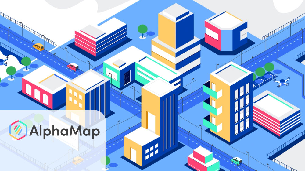
Commercial real estate data lives scattered across dozens of sites and tools. AlphaMap pulls more than fifty sources into one map view, so the script uses the comparison the product earns: the Google Maps of commercial real estate. The back half covers what you see, visitation, car traffic, demographics, ownership, plus the two features that do analysis for you, void analysis and the report builder.
A 2D animated explainer for Shared Storage, a consumer real estate concept, built to make a new idea feel familiar fast.
Motion graphics we produced for ROMIG for a real estate audience.
We make education explainers for edtech platforms and for training programs. These videos teach — a product, a concept or a behavior — in a format students and trainees actually finish. Edtech startups benefit from the same thing schools do: a message that lands the first time, without a live instructor.

Abuzz is an engagement platform for schools, and the video follows the student lifecycle from admit to alum. Students get the directory, groups, events and local discounts. Administrators get the dashboard and push alerts for emergencies and campus news. We closed on retention because that’s the line a school justifies the purchase with.

Part of a training series for construction apprenticeships. The script defines stereotypes, separates them from personal bias, and makes the point that positive ones limit people too: assuming young workers are tech savvy is the same error as assuming older workers can’t adapt. The examples come from the trade, and the four behaviours at the end are all things you can do on site tomorrow.

A life-design lesson borrowed from product design: prototype the career before you commit. The script defines the prototype — a one-day job shadow, a volunteer stint, a summer internship — and lands its argument in one line: fail early so you can succeed sooner. Made for students weighing decisions, it closes on the exact question it wants them to ask themselves.
Motion graphics for Clips University, an education platform for creators.
Legal and accounting work are trust businesses with complicated processes. These professional explainers walk a client through what to expect, step by step, in plain language. Firms and clinics use them to answer the questions every new client asks, before the first appointment.

Stand Informed provides free legal advice to people who’ve experienced sexual assault in BC. The script leads with what’s not required: no gender, age, race or immigration status requirements, and no police report. “What happened is not your fault” sits near the top, not saved for the close. Then the process step by step, intake call, interpreter if you want one, your support worker welcome, a lawyer matched to your case, up to three hours of advice. With a subject this hard, predictability is what a script can offer.

An IRS scam warning told through two characters. Todd gets a text claiming to be the IRS, and his cousin Ruby has been through it, so the lesson arrives as a family conversation: the IRS only contacts you by mail, read the letter carefully, respond by the due date, call the number in the upper right corner. It’s built for the audience the tax clinic serves, and it ends with where to get free help.
A whiteboard animation for 21 Century Law — step-by-step legal explanation in the hand-drawn style that suits it best.

Three sentences of script, each opening with “what if”: seventy years, three generations, over a billion dollars recovered for injured clients. It is a credibility piece — the entire video is the firm’s record, framed as the questions a potential client is already asking. Proof that a law-firm explainer does not need a plot; it needs the numbers said plainly.
Manufacturing and industrial products often live behind an order portal or inside a supply chain. These manufacturing explainers show the process end to end, from order to delivery, in a way a photo or spec sheet cannot. Industrial companies use them to onboard customers and cut support questions.

We made this for International Paper’s ordering portal. The opening image is a customer looking out the window wondering which trailer is holding their boxes. Place an order, check status, print your BOL from the platform instead of requesting it and waiting on a reply. Pick, click, and go opens and closes the video.

Stealthbox is a home grow cabinet, and its buyers have specific worries, so the video answers them with numbers. Four plants, seed to harvest in ten to twelve weeks, up to four ounces per grow, a 100 watt LED board, a 20 by 20 footprint. Light-tight, locking, odor neutral, no flood or fire risk. For this product the spec sheet is the reassurance.

The problem is one wrong pull: decommissioning a mislabeled data-center cable, in a world where human error accounts for 24% of unplanned outages. Brady’s Active ID Label answers with digitally signed cable labels read by a handheld NFC pen, so a technician never guesses which cable does what. The script walks the whole workflow — print, encode, read — because this buyer wants to see the process, not a promise.
A 2D animated product explainer we produced for PakBrake.
Energy is a sector of policy, infrastructure and transition — and of oil, gas and energy projects measured in billions. These power and energy explainers turn technologies, positions and deeply technical tools into stories a general audience, or an approving executive, can follow. Energy companies and alliances use them to move a debate or make the complex credible in ninety seconds.

Our one 3D piece on this list. Contruent’s software manages costs on oil and gas megaprojects, and the subject matter is physical: pipelines, refineries, storage facilities, transport networks. 3D let us show that infrastructure at scale. The script stays in a project manager’s vocabulary, on time, on budget, forecast costs, Power BI dashboards.

“The future is electric” is the opening line, and the stakes land fast: over 80% of R&D programs never reach the market. The Amsterdam Modeling Suite is chemistry software for battery and energy-storage researchers, and the video pitches it as speed — analyze and predict mechanisms down to the atomic level, and get from molecule to market before the race moves on. Sixty-three seconds arguing that software is the shortcut through trial and error.

This one argues against the grain. The first line concedes that windfall profits make Canadian oil and gas look like a winning bet, then the script works through why demand is heading the other way: the clean energy transition, volatile gas markets, coal abroad replaceable by cheap renewables without Canadian LNG. It lands on managed decline as the option that protects jobs and diversifies the economy.

Accelerate is Canada’s zero-emission vehicle industry alliance. We held the organisation’s name back until the case was made: the critical minerals, the innovators, the integrated North American manufacturing base. For an alliance, the member list is the credential, so the script names who it convenes, industry, labour, Indigenous interests, government, academia and research institutions.
Resource industries answer to the public as much as to their customers. These mining and forestry explainers translate land-use plans, conservation science and regulatory frameworks for non-expert audiences. Companies and agencies use them where a report would go unread.

Woodland caribou are a species at risk in Alberta, and they need large areas of undisturbed habitat. This video explains one forestry response, aggregate harvesting, which concentrates logging so fewer access roads fragment the landscape. The 500 metre disturbance buffer around harvest areas and seismic lines made it into the script, which tells you the audience: people who work in land management.

Alberta’s forest planning system runs on an acronym, VOITs, that means nothing to the public. So we opened on the values people already hold, biodiversity, climate, jobs, cultural heritage, and only then introduced the system for tracking them. It closes with a specific ask: attend your local forest management planning meetings.

An internal mission video for New Gold, a Canadian intermediate gold producer mining gold, copper and silver. The script covers the whole mandate — free-cash-flow discipline, environmental stewardship, and the agreements with the Indigenous nations on whose traditional lands its mines operate, spanning education, employment and business commitments. A two-minute example of employee communication done as story rather than memo.
We have produced explainers for cities, utilities and tourism boards. Government explainer videos turn programs, bills and services into plain-language answers residents actually watch. For public bodies, one video replaces thousands of repeated phone calls and counter questions.

At 6:37, the outlier on this page, and a different job: a step-by-step walkthrough for customers who just received a leak alert. Log into My Water Tracker, read the leak indicator on your meter, shut the main valve to work out whether the leak is indoors or out, then check the usual suspects. The food colouring test for toilet tanks is in there. Instructional video runs long because every step has to be followable at home.

A kids’ video about how milk gets made. A host walks the journey from the cow’s meal through all four stomach compartments, each compared to something a kid already knows, the omasum is like a big sponge. The fact they’ll repeat at dinner is that cows chew cud about sixty times a minute. It ends by asking them to name dairy products themselves.

Tourism Burnaby needed an economic impact report people would actually watch. We gave the three layers of impact three sets of visitors: a Calgary family at the Halloween festival for direct spending, a clean energy conference for indirect, and the ringette championships for induced. The numbers build to $1.28 billion in annual economic output.
A 2D animated explainer produced for Lean BC, a Government of BC program.
Motion graphics for the CVRD, a regional district government in British Columbia.
Nonprofits have the hardest brief: changing minds with no product to sell. These nonprofit explainers carry campaigns, advocacy and public education for organizations like YWCA Canada and IISD. A clear one-minute story stretches a small budget across social, events and fundraising.

IISD asked us to explain WTO fisheries subsidy negotiations to the public. The script covers the stakes, over a third of marine fish populations are overfished, then twenty years of history: negotiations opening, the 2015 Sustainable Development Goals, the missed 2020 deadline, the sticking points on developing-country flexibilities. It ends on “your ocean” and the ask.

FCA supports people caring for family with complex needs and cognitive impairment. The video opens with the scale of unpaid care in the US, nearly 38 million people giving 36 billion hours, then alternates the organisation’s numbers with quotes from actual caregivers. Three thousand caregivers served in the Bay Area, 1.2 million website visitors, resources in Spanish, Chinese, Tagalog and Vietnamese, and a research program built on de-identified data. The caregiver quotes carry the emotional weight so the narration doesn’t have to.

YWCA Canada’s project on online hate, made for young people. We didn’t open with fear. The script acknowledges digital life is both exciting and nerve-wracking, then names the harms plainly: shared intimate images, stolen personal information, harassment. “Everyone is vulnerable, and you are not alone” comes before the statistics on who gets targeted most. It closes on the internet as a place that can still be safe and joyful.

A one-minute legislative ask. Some insurers stopped counting drug-maker financial assistance toward out-of-pocket costs, and patients find out mid-year when they’re suddenly on the hook for thousands in refills. The script explains that mechanism without ever using the industry term for it. One sentence of moral framing, nobody should have to choose between medication and food, then the policy ask and a URL.

The first video in a Small Business BC series on accessible workplaces. It opens and closes on the same question, what do you think accessibility means, and asks at the end whether your answer changed. In between it defines barriers, quotes the Accessible Canada Act, and puts numbers on the gap: over 20% of British Columbians identify as having a disability, and unemployment runs 6.9% against 3.8%. The cost objection gets asked out loud and answered with the Retail Council of Canada’s finding that more than two-thirds of accommodations cost under $500.

Twenty-five seconds on farm plastic recycling. The phrase “every step” does all the structural work, asked as a question and answered four ways: silage bags, bale wrap, on-farm compacting, local collection sites. At this length there’s room for one device and four details.
Four things show up in every one of the videos above that does its job.
Start where the viewer already is, with the pain or the question they have, then bring in the answer. Leading with features asks people to care before they understand why.
An explainer that tries to say everything says nothing clearly. Decide the single idea the video has to land and cut the rest.
Length is a symptom, not a target. A regulated or technical subject needs the time, a single-promise product does not. The table above is what that looks like across 35 videos.
Animation gets attention, but the script and voiceover do the explaining. A clear, well paced script is what makes an explainer actually explain.
One explainer can serve several places. A 60 to 90 second version fits the homepage and ads, a shorter cut suits paid social, and a longer version works for onboarding or sales. Plan the edits up front so one production stretches across placements.
8 in 10 B2B teams now call LinkedIn their main video channel, and 76% change the aspect ratio per platform. Both figures are in our 2026 video statistics.
Most of the videos above sit in the $5,000 to $10,000 range. That’s where a scripted, custom animated 60 to 90 second piece usually lands. Premium work with custom characters or 3D runs $10,000 to $25,000. Enterprise programs with several deliverables and localisation run $25,000 to $50,000.
Timeline is normally four to eight weeks from kickoff to final file. Script and storyboard take about the first third.
We break the whole thing down here: how much an explainer video costs.
Costs move with scope, not with studio size. If you would rather talk it through than guess, we are an explainer video production company and every video on this page came out of our own studio.
If you are earlier in the process than picking a reference, the sections below cover what an explainer video is, the different types of explainer videos,, the styles available, how one gets made, and what usually goes wrong.
I am Larry Mutenda, and I have been running Creamy Animation, an explainer video studio, since 2009. Across 15+ years and 500+ projects, my team and I have produced explainers for SaaS and tech companies like Skyflow, Blockdaemon, and CoPilot AI, alongside organizations such as New Gold, Dr. Bill by RBC, the Responsible Gambling Council, Tourism Burnaby, and CLAS BC. Along the way we have helped a client video pass 360,000 views and support a $30M Series B round, and turned a lot of complicated products into 60-second stories people actually finish.
“From the start, Larry and his team provided detailed guidance on the different stages of the project such as scripting, voice work, and illustrations. In the end, everything came together beautifully.” — Duong Tran, Dr. Bill by RBC
“Larry and his team were efficient and effective in producing a high-quality animated explainer video that met our need perfectly.” — Sam Numsen, Marketing Manager, New Gold Inc.
“The entire experience working with Creamy Animation was fantastic. They truly listened to our ideas. They were responsive every step of the way, whether it was the character design, storyboarding, voiceover, and animation.” — Phillip Nguyen, Operations Coordinator, Responsible Gambling Council
Want inspiration first? Browse our roundup of the best explainer video examples.
Producing a SaaS video? See our step-by-step SaaS video production guide.
An explainer video is a short, story-driven video, usually 30 to 90 seconds long, that shows what a product, service, or idea does and why it matters. Most are animated, live on a homepage or landing page, and turn something complex into something a viewer understands in under two minutes.
The job of an explainer is to answer three questions quickly: what is this, who is it for, and why should I care. It pairs a tight script with animation or motion graphics and usually a voiceover, compressing a pitch that might otherwise take a long web page into a minute or two of video that people actually watch.
The terms overlap: an explanation video, a video explanation, or an animated explainer all mean the same thing. By definition, an explainer video takes one product or idea, strips it to its core, and explains it in plain language — that is the whole explainer meaning in one sentence.
Most explainer videos come down to a handful of types, and choosing between explainer video types is mostly about matching the style to the job. The right one depends on your product, your budget, and the story you need to tell.
| Style | Best for | Notes |
|---|---|---|
| 2D animation | SaaS, apps, software | Most popular and flexible |
| 3D animation | Hardware, physical products | Depth and realism; premium |
| Motion graphics | Fintech, data, social ads | Text and numbers carry it |
| Whiteboard | Step-by-step teaching | Hand-drawn, simple |
| Live action / mixed media | Real people or product | Footage plus animation |
| Product demo / screencast | Software walkthroughs | Records your real interface |

This is the one we make most. It is flexible, it suits almost any product, and it hits the sweet spot between character and cost, which is why it is the default for most SaaS and app explainers. We used it for Ubuntu by Canonical, turning an open-source operating system into a clear, friendly story. See our 2D animation work.
When the value is in a physical object or a spatial idea, 3D earns its keep. It adds depth and realism you cannot fake in 2D, so it fits hardware, products, and technical concepts. We built one for Contruent, a construction management platform, where showing the system in space made it click.

If your story is really about data, numbers, or a process, motion graphics let the text and shapes carry it without characters getting in the way. It is a natural fit for fintech and analytics. Our work for Blockdaemon leaned on this to make blockchain infrastructure understandable. See our motion graphics work.

Whiteboard is the versatile workhorse. The hand-drawn look suits step-by-step teaching and slower, explainer-heavy subjects, which is why it works for education and professional services. We used it for a law-firm explainer where the goal was to walk people through a process one step at a time. See whiteboard animation.
Sometimes you need a real face or a real product on screen. Mixing footage with animated overlays gives you that human, credible feel while keeping the energy of animation. We took this approach for Providius, blending live action with motion graphics.

When seeing the actual product is the selling point, a screen-recorded demo beats any illustration. It shows your real interface, step by step, which suits software walkthroughs and onboarding, and it pairs well with a shorter animated explainer up top.
Explainer video gets used as a catch-all, so it helps to be clear about what makes one different from its neighbors. An explainer exists to make something understood. Everything about it serves clarity first.
| Type | What it is really for | Length |
|---|---|---|
| Explainer video | Making a product or idea genuinely understood, by leading with the problem and showing how you solve it | 30–90 sec |
| Promo / commercial | Building awareness and brand feeling, leaning on emotion more than explanation | 15–60 sec |
| Product demo | Showing the product feature by feature, for someone already interested | 1–5 min |
| Testimonial | Building trust by letting a real customer tell their story | 1–2 min |
Most explainer video production runs through seven steps.
See our animation production process for more.
The most common reasons an explainer underperforms: leading with the product instead of the viewer’s problem; trying to say everything, so nothing lands; running too long; a weak or missing call to action; and treating the script as an afterthought when it is the single biggest lever on the result. A sharp script beats a muddled one every time.
We’ve made explainer videos for Fujitsu, Canonical, Warner Brothers and the World Shipping Council. Tell us what you’re trying to explain and we’ll tell you what it takes.
15+ years in video strategy and production, specializing in SaaS, B2B, and nonprofit storytelling.
Larry is the founder and Chief Storyteller at Creamy Animation, founded in 2009. He leads a team that creates story-driven videos for businesses and nonprofits. A marketer, designer, and animator, Larry has overseen the production of more than 1,500 videos for Fujitsu, Logitech, Warner Brothers, NFL, Blockdaemon, Astronomer, Canonical, and 370+ others.
For Larry, God is first, and everything else is a blessing that comes from serving Him. When he’s not working, he’s hanging out with his wife and three kids, playing the piano, or pursuing his filmmaking side hustle.Â